

Designing with colour: creating hygienic and comfortable environments
Colour has a profound impact on our emotions and behaviour. In hygienic spaces such as hospitals, laboratories, and food preparation areas, the choice of colour is not just about aesthetics. Colour influences perceptions of cleanliness, mood, and even efficiency. Understanding how colour affects feelings can help create environments that are not only visually appealing but also support well-being and hygiene.
Last year, Altro introduced a refreshed Whiterock Satins range, giving architects and designers a broader palette of choices for creating soothing, visually relaxing environments. Including subtle off-white shades and tonal hues, the revamped collection enhances design flexibility while adhering to modern Light Reflective Value (LRV) guidelines.
The revived palette is thoughtfully selected to complement Altro’s flooring solutions to enhance design possibilities, making it easier than ever to create harmonious and visually stunning interiors where walls and floors seamlessly blend.
In this blog, we explore the importance of designing with colour and how products such as Altro’s updated Satins range can help to create spaces that promote well-being.
The impact of colour on mood and behaviour
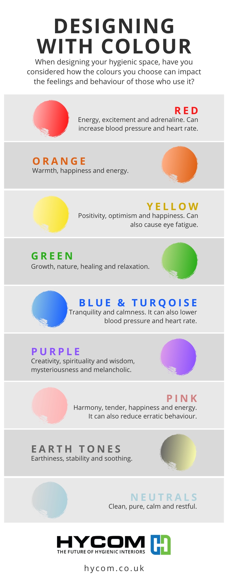
Different colours evoke different psychological and emotional responses. Here are some key colour associations:
White: Symbolises cleanliness, sterility, and simplicity. It is widely used in hygienic spaces because it enhances the perception of cleanliness. However, excessive white can feel stark and uninviting. It can be quite draining after long periods of time.
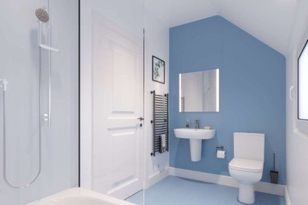
Blue: Evokes calmness, trust, and efficiency. Blue can also lower blood pressure and heart rate and is commonly used in hospitals and clinics to create a soothing atmosphere. Breeze - a clean light blue, and Twilight - rich and deep, are two new additions to Altro’s Satins range.
Green: Associated with nature, balance, and healing. Soft greens can reduce anxiety and promote relaxation, making them ideal for healthcare settings. An example is Serenity, also from Altro’s Satins palette - a welcoming mid-tone green.
Yellow: Represents warmth and energy. Light shades, such as Altro’s Honeydew, can create a sense of positivity, but overly bright yellows may cause agitation in sensitive environments.
Grey: Conveys neutrality and professionalism. Whilst earthy tones can provide a modern feel, too much grey may feel cold or uninspiring. Altro’s Silk is a quiet grey that will work in any scheme, cool or warm, and a favourite neutral.
Red: Symbolises energy, alertness and adrenaline. Whilst useful in highlighting emergency areas or signage, too much red can create a sense of stress and can increase blood pressure and heart rate.
The importance of Light Reflectance Value (LRV)
Light Reflectance Value (LRV) is a crucial factor when choosing colours for hygienic spaces. LRV measures the amount of light a colour reflects, on a scale from 0 (black, absorbing all light) to 100 (white, reflecting all light).
Maximising natural light: High LRV colours, such as whites and pastels, help reflect natural and artificial light, making spaces appear brighter and more open. This is particularly beneficial in healthcare and laboratory environments where good visibility is essential.
Enhancing hygiene perception: Lighter colours with high LRV can make it easier to spot dirt and contaminants, supporting rigorous hygiene standards in clinical and food-safe settings.
Energy efficiency: By reflecting more light, high LRV colours can reduce the need for excessive artificial lighting, contributing to energy efficiency and sustainability.
Balancing comfort and functionality: While high LRV colours improve visibility and openness, combining them with mid-tone shades can prevent spaces from feeling overly stark or clinical.
Designers must consider the LRV when selecting colours, especially when adhering to regulations that require a 30-point difference between critical surfaces like walls and floors. This can present challenges, but Altro’s refreshed Satins range helps designers meet these guidelines without compromising on aesthetics or performance.
Incorporating biophilic design
Biophilic design is an approach that integrates natural elements into built environments to promote well-being and reduce stress. In hygienic spaces, where a sterile atmosphere can sometimes feel cold and impersonal, biophilic design can help create a more comfortable and restorative environment.
Natural elements have become an inspiration for interior colour schemes. Strong, bold colours are used sparingly, similar to how bright flowers contrast against more subdued backgrounds in nature. Soft blues and greens, reminiscent of the sky and fields, are favoured to bring tranquillity indoors, aligning with our innate connection to the natural world.
Using natural colours: Incorporating shades inspired by nature, such as soft greens, warm earth tones, and sky blues, can create a calming and refreshing atmosphere.
Adding natural textures and patterns: While maintaining hygiene standards, surfaces that mimic natural materials, such as wood-effect laminates or stone-inspired finishes, can enhance visual interest and comfort. Take a look at Altro Wood.This is an attractive, general purpose 2mm wood-effect vinyl safety flooring available in a range of designs with different plank sizes and shades including wide plank, classic and rustic designs, helping you create the right look for areas where people live and work.
Introducing indoor plants: Where appropriate, the inclusion of easy-to-maintain plants can contribute to air quality and a sense of well-being, helping to soften the sterility of clinical environments.
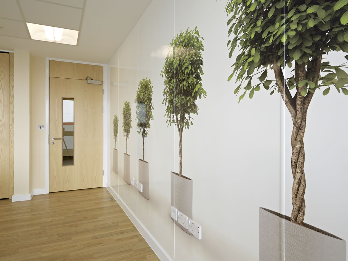
Maximising views of nature: Designing spaces to allow for views of outdoor greenery or incorporating nature-themed artwork can help reduce stress and improve overall patient and staff experiences. Altro’s Digiclad is a perfect example of a wall cladding sheet, available in generic or customisable designs, that will help you bring the outdoors inside.
Choosing the right colours for hygienic spaces
When designing a hygienic space, it is important to consider how colour impacts both functionality and emotional well-being. Here are some key factors to keep in mind:
Balance sterility with comfort: While white is a classic choice for hygiene, incorporating soft blues, greens, or warm neutrals can make spaces feel more welcoming without compromising the sense of cleanliness.
Use colour to define zones: Different colours can help differentiate areas within a space, such as calming tones in patient rooms and energetic hues in staff areas.
Consider light and reflection: Lighter colours can make a space feel more open and bright, while darker shades can create a more enclosed feeling. Understanding LRV ensures optimal lighting conditions.
Hygiene and maintenance: Some colours may show dirt and stains more easily than others. Light pastel shades or patterned surfaces can help mask minor imperfections while maintaining a clean look.
Accessibility and inclusivity: Consider how colour choices impact those with visual impairments or sensitivity to bright shades. High contrast can help with wayfinding and usability.
Conclusion
The strategic use of colour in hygienic spaces goes beyond aesthetics; it shapes the way people feel and interact with their environment. By carefully selecting colours that promote calmness, clarity, and efficiency while considering factors like LRV and biophilic design, designers can create spaces that not only meet hygiene standards but also enhance comfort and well-being. Whether in a hospital, laboratory, or food-safe environment, colour psychology plays a vital role in designing spaces that are both functional and inviting.
