
The Refreshed Altro Whiterock Satins Range: A New Era in Hygienic Design
This summer, Altro introduced a refreshed Whiterock Satins range, giving architects and designers a broader palette of choices for creating soothing, visually relaxing environments. With 27 stunning colours to choose from, including subtle off-white shades and tonal hues, the revamped collection enhances design flexibility while adhering to modern Light Reflective Value (LRV) guidelines.
In this blog, we explore the importance of designing with colour and how Altro’s updated Satins range supports creating spaces that promote well-being, clarity, and long-lasting success.
A Harmonious Floors and Walls Palette
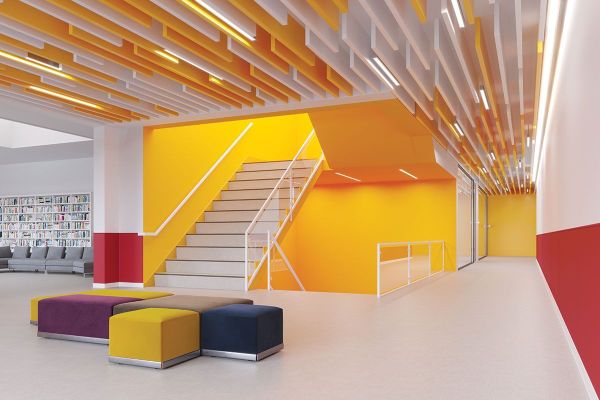
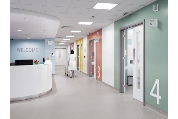
In response to customer feedback and evolving market trends, Altro has refreshed its range by introducing 10 exciting new colours (below), replacing less popular shades. These dynamic additions are thoughtfully selected to complement Altro’s flooring solutions, making it easier than ever to create harmonious and visually stunning interiors where walls and floors seamlessly blend. This update not only enhances design possibilities but also simplifies the process of achieving cohesive, stylish spaces. With more options, you can now mix and match Altro Satins walls with Altro floors to perfectly tailor your desired scheme.

Designing with Colour to Inspire Workspaces
The environments we work in have a significant impact on our mood, productivity, and overall experience. Extensive research into the psychology of spaces has shown that environments influence how we feel, interact, and perform. For instance, clinical spaces dominated by white can feel sterile and uninspiring, while spaces with more thoughtful colour choices can promote a sense of calm, focus, and well-being.
Designing with colour is not just about aesthetics; it’s about creating spaces that people want to be in, whether they are patients, clients, or staff. Front-of-house and back-of-house areas should equally benefit from a well-thought-out colour scheme, improving both the user experience and the overall atmosphere.
Colour in Modern Design
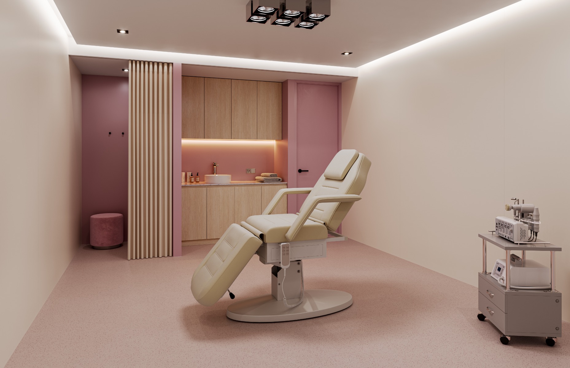
Psychological research has deepened our understanding of how colour affects well-being and performance, especially in sectors like healthcare, where environments need to accommodate diverse needs. The design of mental health spaces, for instance, has been influenced by research into neurodiversity, showing that colour choices can significantly impact how individuals feel and function in these areas. Altro’s refreshed Satins palette offers a wide array of Chroma values throughout both wall and floor combinations, providing an extensive selection of colours that don’t just look nice but also provide the desired outcome where it matters.
Natural elements have become an inspiration for interior colour schemes. Strong, bold colours are used sparingly, similar to how bright flowers contrast against more subdued backgrounds in nature. Soft blues and greens, reminiscent of the sky and fields, are favoured to bring tranquillity indoors, aligning with our innate connection to the natural world.
Sustainable Colour Choices
The intensity of colours plays a crucial role in how we perceive and live within a space. Research has shown that highly saturated colours can become overwhelming over time. Today, designers prefer softer, more sustainable hues that are easier to live with in the long run. Altro’s new Satins palette reflects this shift, offering colours that are toned down and warm, creating environments that are visually appealing and comfortable over extended periods.
Light Reflective Value (LRV) and Design Regulations
Designers must consider the LRV when selecting colours, especially when adhering to regulations that require a 30-point difference between critical surfaces like walls and floors. This can present challenges, but Altro’s refreshed Satins range helps designers meet these guidelines without compromising on aesthetics or performance.
Gloss vs. Satin: Which is Right for Your Project?
When choosing between gloss and satin finishes, it often comes down to personal preference, though the functional differences are worth considering. Gloss finishes, for example, offer a sleek, reflective surface that can add a premium feel to a project. Gloss is also a cost-effective alternative to painted glass, being lighter and easier to install. Its reflective qualities can enhance light and create visual interest.
On the other hand, satin finishes are becoming increasingly popular for their contemporary, matt appearance. Satin is less reflective, which can be beneficial in environments where a more subtle, calming atmosphere is desired. Satin also reduces glare, making it a practical choice in spaces designed for visual comfort.
Conclusion
Altro’s refreshed Whiterock Satins range opens up new possibilities for architects and designers, offering a carefully curated selection of colours that not only meet modern design requirements but also promote well-being and sustainability. Whether you choose gloss or satin, Altro’s updated palette ensures that your project will achieve both functionality and aesthetic appeal.
By incorporating the latest insights into colour psychology, sustainability, and LRV standards, Altro is leading the way in creating spaces that look good, perform well, and support the people who use them.
You can find the full Altro Whiterock Satins Range here