

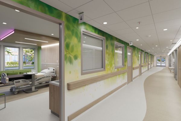
Designing for Wellbeing
Supporting Mental Health Awareness Week (11th - 17th May 2026)
Each year, Mental Health Awareness Week encourages us to think more deeply about how we support wellbeing, not just through conversation, but through the environments we create.
This year, the theme is “taking action”; focusing on the practical steps we can take to support mental health.
One of those steps includes creating spaces that promote wellbeing. In healthcare settings, general workplaces, education and public spaces, design has a powerful influence on how people feel. And one of the most effective tools at our disposal is colour.
Why colour matters
Colour isn’t just a finishing touch, it can directly impact mood, behaviour, and overall experience. The right palette in a room can help create calm, reduce stress, and improve focus. On the other hand, poor colour choices can make spaces feel stark, overwhelming, or unwelcoming.
In environments where people may already feel anxious, like hospitals, clinics, or busy workplaces, this becomes even more important. Thoughtful colour selection can help soften these experiences and create a more reassuring atmosphere.
Creating calm with softer tones
Soft, muted tones, such as gentle greens, warm neutrals, and subtle blues, are widely associated with calmness and relaxation. These colours help reduce visual stress and create spaces that feel more comfortable and inviting.
This approach works particularly well in:
- Healthcare and treatment rooms
- Waiting areas
- Staff breakout spaces
Wall cladding systems like Altro Whiterock Satins are designed with this in mind, offering a palette of soft, contemporary colours that allow designers to introduce warmth and calm without compromising on hygiene or durability.
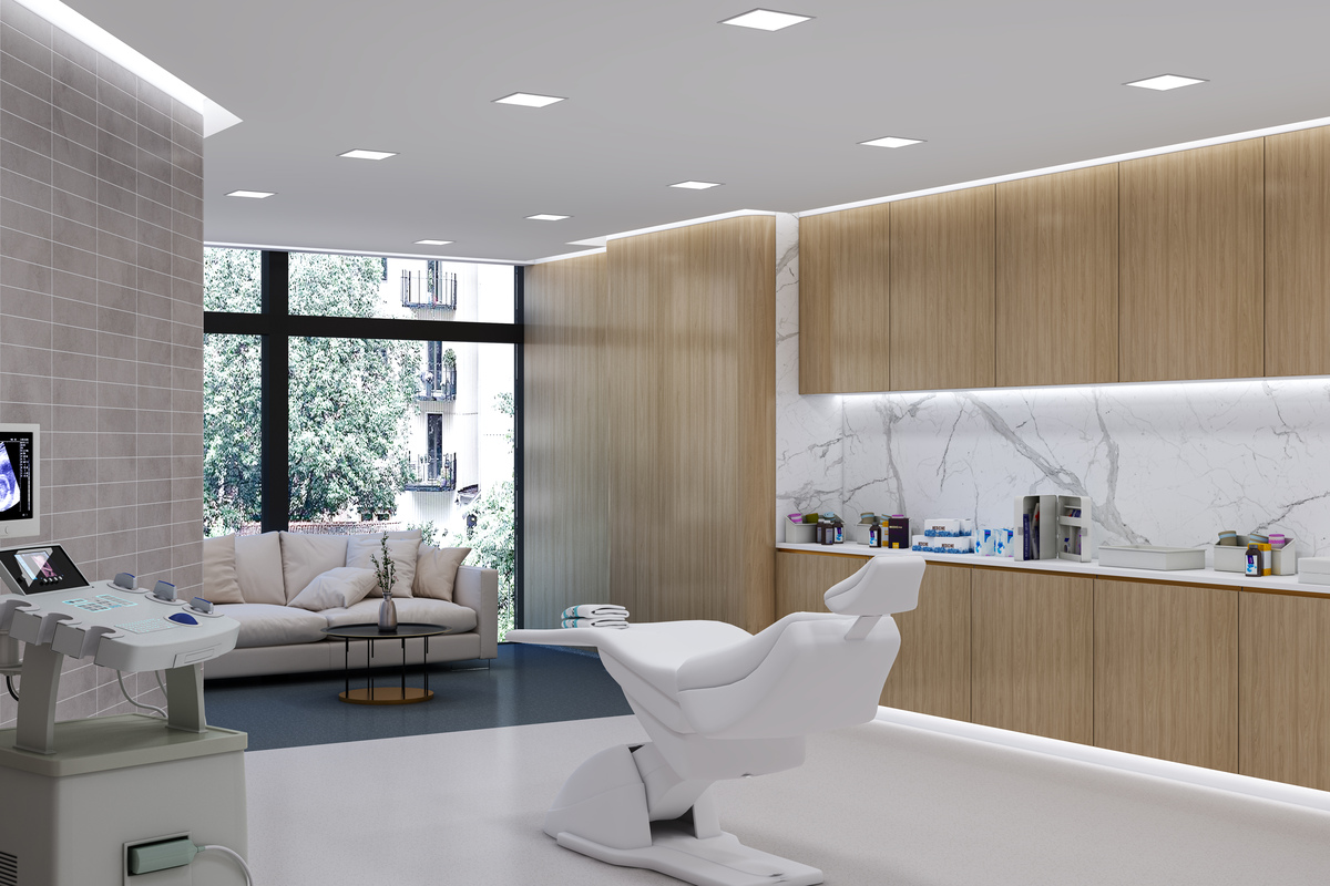
Using colour to guide and support
Colour also plays an important functional role in how we experience a space. It can help people navigate their surroundings more easily and with greater confidence.
For example:
- Clear contrast between walls, floors, handrails and doors improves visibility
- Colour zoning can define different areas and reduce confusion
You’ll find lots of solutions supplied and installed by Hycom to make it easier to achieve this balance, combining practical performance with design flexibility.
Balancing energy and comfort
Creating calm in certain environments is essential, but some areas benefit from a more energising feel. Social spaces, gyms, and collaborative environments can benefit from warmer tones or slightly more vibrant colours to encourage interaction and positivity.
The key is balance. Too much intensity can feel overwhelming and too little can feel uninspiring. Thoughtful design ensures each space supports its purpose whilst maintaining overall harmony.
Designing with performance in mind
In many sectors, particularly healthcare, education, and food preparation, materials are required to strict hygiene standards.
That’s where high-performance wall cladding solutions, such as those from Altro, come into their own. They allow specifiers to introduce colour confidently, knowing the materials are:
- Durable and impact-resistant
- Easy to clean and maintain
- Suitable for demanding, high-traffic environments
This means you don’t have to choose between practicality and design. You can achieve both.
Designing for people
Designing for wellbeing is about putting people first. It’s about creating spaces that feel calm, clear, and supportive for all who use it - patients, staff, and visitors.
During Mental Health Awareness Week, it’s a timely reminder that even small design decisions can have a meaningful impact.
By combining thoughtful colour choices with high-quality materials from providers like Hycom and Altro, it’s possible to create environments that support both physical and emotional wellbeing.
Because ultimately, great design isn’t just about how a space looks, it’s about how it makes people feel.


